
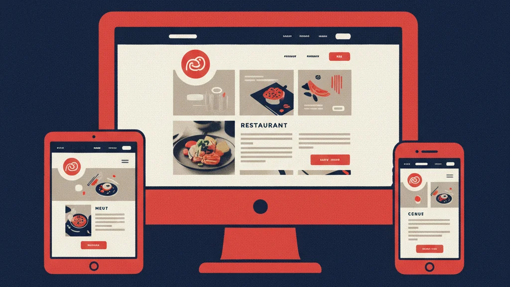
The best restaurant website designs don’t win awards for their visual creativity. They win customers. They load in under a second on mobile, guide visitors from landing to ordering or reserving in as few steps as possible, and build organic search visibility that compounds over time.
Most “best restaurant website” roundups are curated by designers evaluating aesthetics. This one is curated by performance — PageSpeed scores, conversion architecture, local SEO structure, and the specific design choices that separate restaurant websites that drive revenue from restaurant websites that just exist.
Here are 15 restaurant website design examples worth learning from, broken down by what they get right and why it works.
What Makes a Restaurant Website Design Actually Convert?
Before the examples: the criteria. Great restaurant website design has five measurable dimensions:
- Mobile performance. PageSpeed 90+ on mobile. LCP under 2.0 seconds. 80%+ of restaurant searches happen on phones — a slow mobile site loses customers before they see a single dish.
- Conversion architecture. Primary CTA visible above the fold. Navigation that surfaces the menu, ordering, and reservations in one tap. No friction between intent and action.
- Food photography execution. Professional photos of real dishes, properly optimized (WebP format, correct sizing, fast load), used strategically rather than decoratively.
- Local SEO structure. Restaurant and LocalBusiness schema markup. NAP consistency. Google Business Profile alignment. Location-specific content that ranks for neighborhood searches.
- Ownership and control. Self-hosted on a platform you own — not rented from a SaaS provider who can increase prices, deprecate features, or shut down with your data inside.
The examples below are selected because they nail at least three of these five dimensions consistently. Each one teaches something specific.
1. Sweetgreen — Digital-First Ordering Architecture
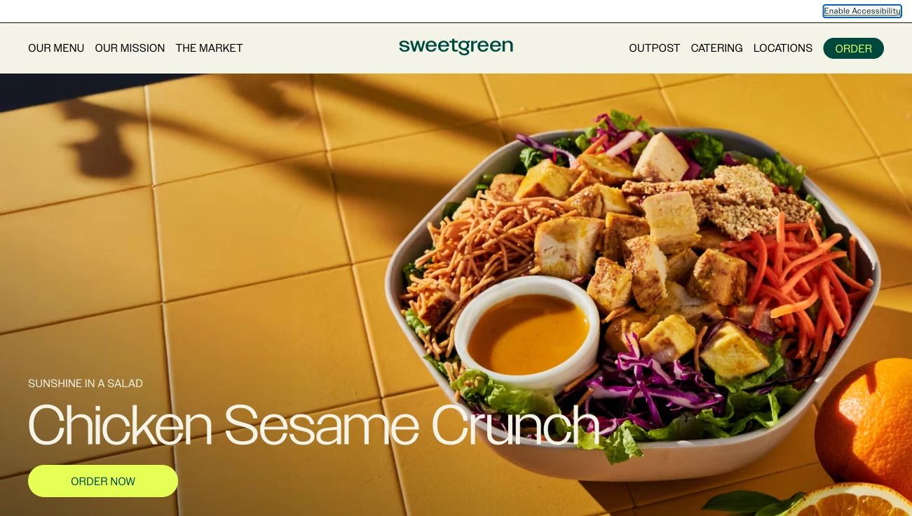
Sweetgreen’s website is built around a single conversion goal: get you into the ordering flow. The homepage confirms the concept (fast, healthy, seasonal), establishes locations, and routes immediately to Order. There’s no meandering — the information architecture is engineered around the most common visitor intent.
What to steal: The “Order” button is the most prominent element above the fold across every device size. Sweetgreen treats ordering as infrastructure, not a feature. If online ordering is central to your revenue model, your homepage should make it impossible to miss.
2. Shake Shack — Brand Clarity at Scale
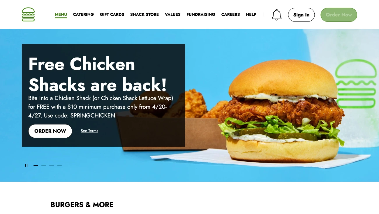
Shake Shack’s website resolves the hardest design challenge for multi-location chains: be locally relevant while maintaining brand consistency. Their location finder is fast, surfaces the nearest location immediately, and feeds directly into ordering or directions. The menu is HTML-structured, not a PDF, with item photography that does the selling.
What to steal: Location-first architecture for multi-unit operations. Each Shake Shack location has enough distinct identity that a visitor feels like they’re dealing with their local Shack — not a faceless chain. If you have multiple locations, each one needs its own dedicated page with local content, not just a pin on a map.
3. Chipotle — Conversion Flow Mastery
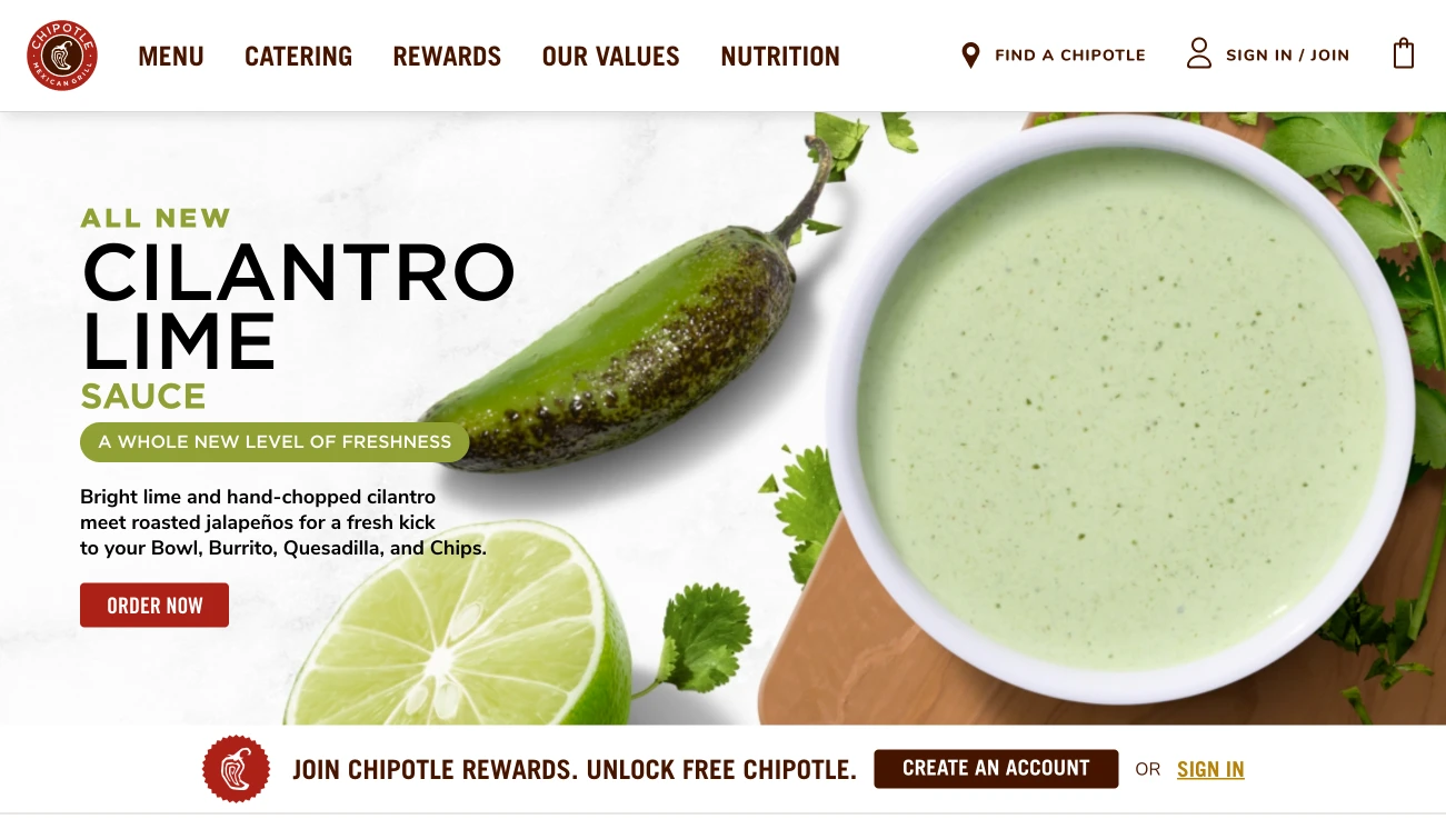
Chipotle’s digital ordering experience is studied by UX designers across industries, not just restaurant tech. The online ordering flow has been tested and refined to minimize the steps between “I want a burrito” and “order confirmed.” Their ingredient photography is also a masterclass — every item looks exactly as it will appear in person, building trust before the purchase.
What to steal: Menu photography that accurately represents the actual product. Visitors who get exactly what they expected when their order arrives are more likely to reorder. Aspirational food photography that overpromises creates disappointment and reduces repeat orders.
4. Nobu — Premium Experience Signaling
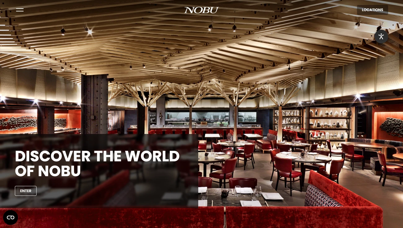
Nobu’s website does something most restaurant sites fail at: it communicates price and experience level immediately, without stating either explicitly. The photography, typography, and pacing signal “exceptional fine dining” before a visitor reads a word. This is crucial for luxury and upscale concepts — guests self-select, inquiries are qualified, and the reservation system handles genuinely interested guests.
What to steal: Intentional pacing and restraint. Fine dining websites that try to show everything — every menu item photographed, every award mentioned, every press quote featured — dilute the premium signal. Less, presented exceptionally, communicates quality more effectively than comprehensive coverage.
5. In-N-Out — Radical Simplicity
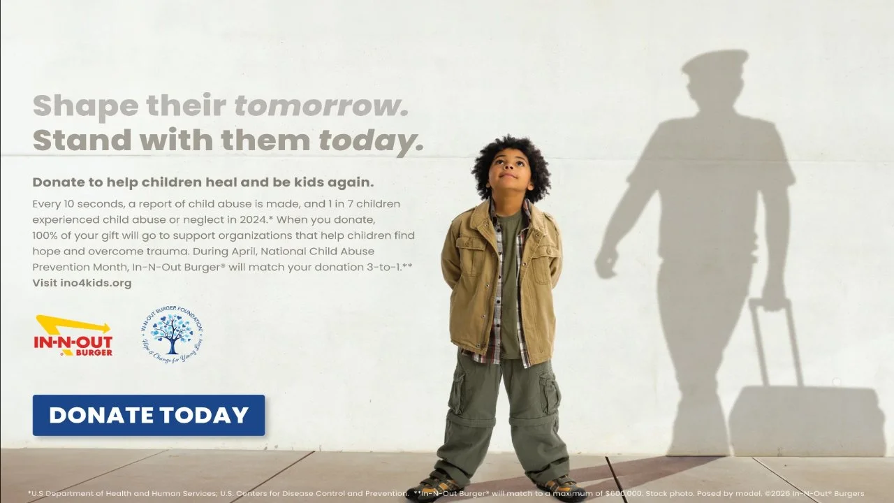
In-N-Out’s website is deliberately minimal in a way that only works when your brand is strong enough to carry the site. The menu is simple, the photography is focused, the location finder is fast. What’s remarkable is what’s absent — no elaborate animations, no complex navigation, no design flourishes. The site loads instantly and does exactly what visitors need.
What to steal: The discipline to remove unnecessary elements. Every addition to a website adds load time, cognitive load, or both. Ask of every design element: “does this help a visitor find the menu, place an order, or get to our location?” If the answer is no, question whether it belongs.
6. The French Laundry — Reservation-Focused Luxury
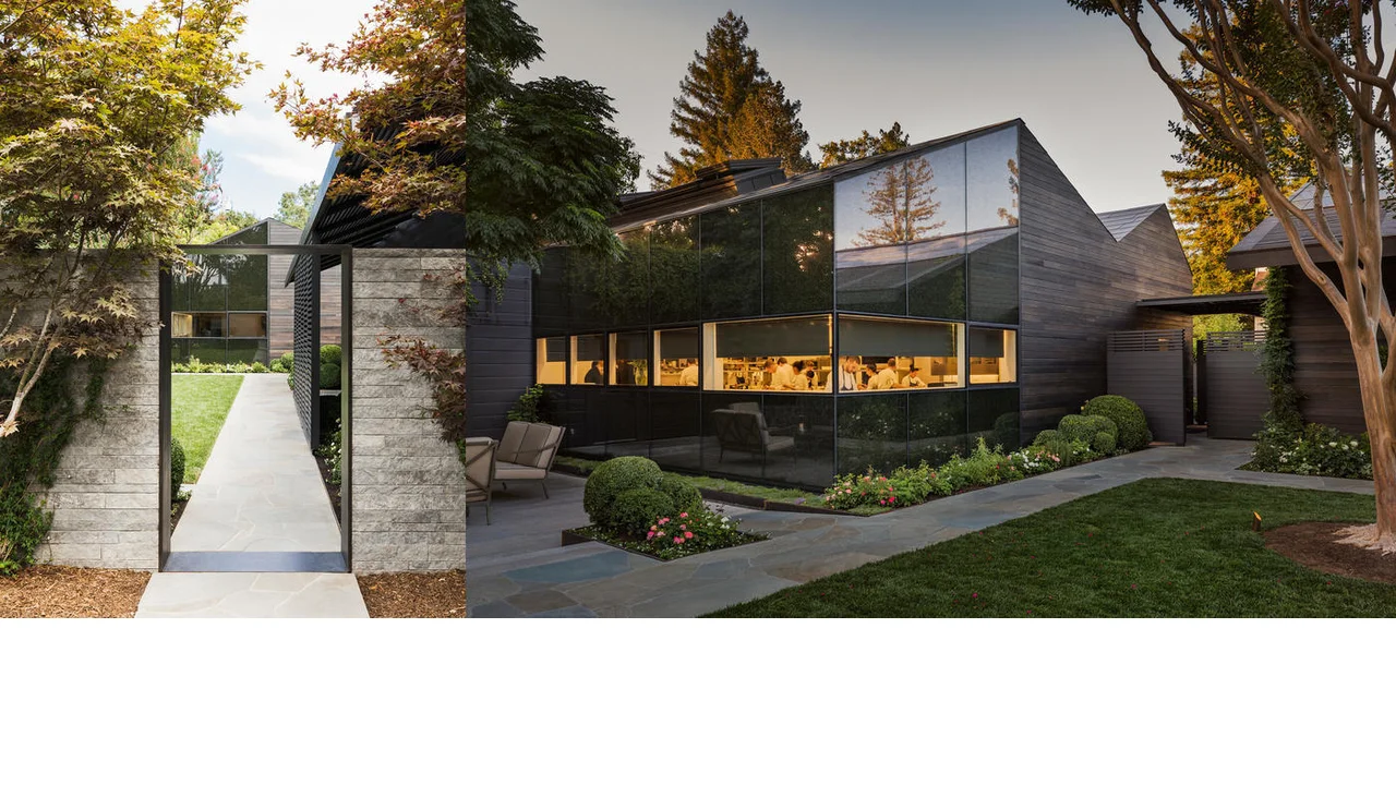
The French Laundry’s website is entirely reservation-focused — the primary conversion is booking a table at one of the hardest-to-get reservations in the world. Every design decision supports this goal: the imagery communicates the food and atmosphere, the About section establishes the pedigree and story, and the reservation system is front and center. There’s no online ordering, no menu PDF, no digital distractions from the single purpose of the site.
What to steal: Ruthless alignment of your site’s design with its single most important conversion goal. If reservations are your revenue driver, design your site like a reservation engine, not a brochure.
7. Momofuku — Brand Storytelling as Conversion
Momofuku operates multiple distinct concepts under one brand. Their website navigates this challenge through strong brand storytelling that creates emotional connection before the visitor selects a location or concept. The About section isn’t a corporate “who we are” page — it communicates genuine personality, craft, and point of view. This is what makes restaurant brands memorable and shareable.
What to steal: Treat your About page as a conversion tool, not an obligation. Restaurants with compelling brand stories on their websites convert more first-time visitors — people who found you through search rather than personal recommendation need a reason to trust you before they visit or order.
8. Eataly — Complex Multi-Concept Navigation Done Well
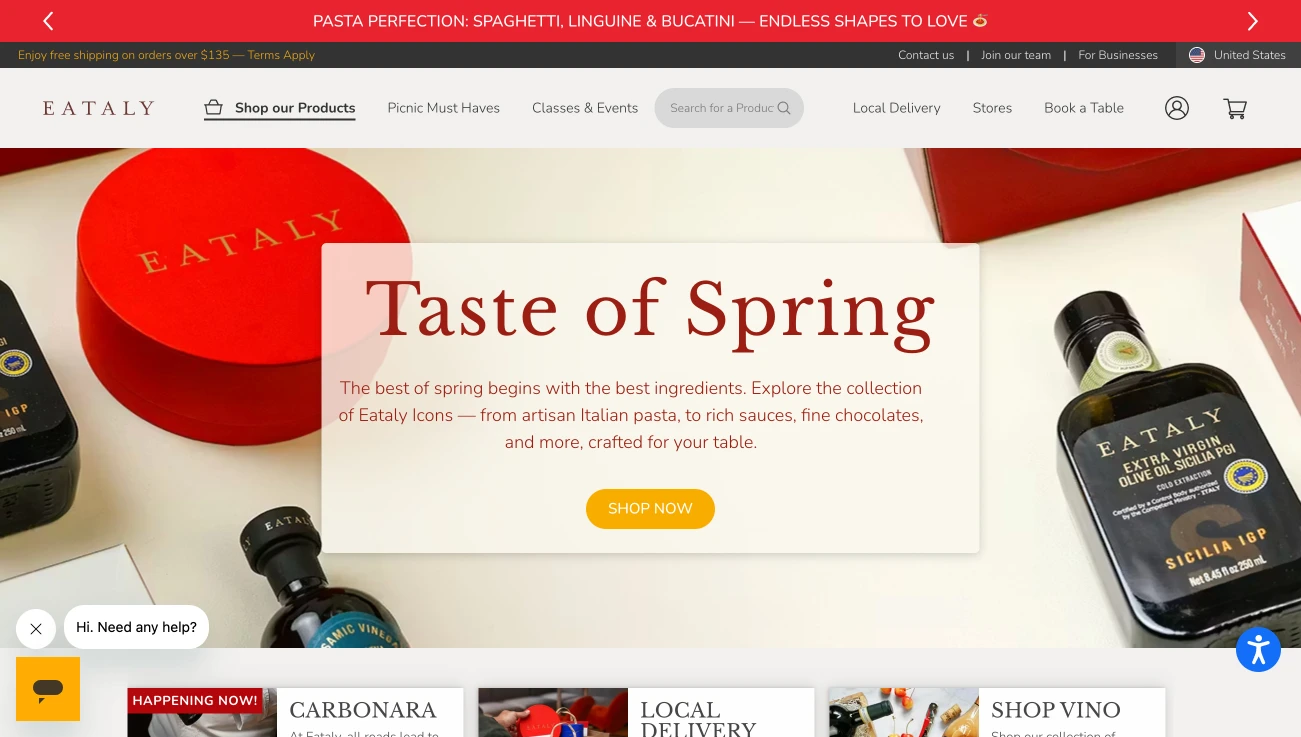
Eataly is genuinely one of the hardest website design challenges in the restaurant world: it’s a marketplace, restaurant, cooking school, and grocery store in one. Their website resolves this by giving each concept space to breathe within a unified architecture. Location-specific content surfaces correctly. The search experience is strong. This level of complexity is an edge case, but Eataly demonstrates that even the most complicated restaurant structures can be navigated effectively with proper information architecture.
What to steal: If your restaurant has multiple revenue streams (dine-in + catering + private dining + retail), give each a dedicated section with its own landing page and URL. Don’t try to serve all audiences from a single page.
9. A High-Performing Houston Taqueria — Local SEO Execution
Not all of the best restaurant website design examples are national chains. Some of the most instructive examples are independent restaurants that have executed local SEO so effectively that they consistently outrank larger competitors in their market. If you’re building from scratch, our step-by-step guide to creating a restaurant website covers every decision from domain to launch.
One Houston taqueria running on a custom WordPress build achieves a PageSpeed score of 98 on mobile, ranks on page one for twelve local search terms including “[cuisine] restaurant [neighborhood]” variants, and generates 65% of its online orders directly — bypassing delivery app commissions entirely. The site has no paid advertising. The traffic is entirely organic, earned through technical performance, complete schema markup, and consistent content.
What to steal: PageSpeed and schema markup are not optional SEO bonuses. They are the foundation of local search visibility. A custom WordPress build optimized to 98 on mobile outperforms a $500/month SaaS restaurant builder every time in Google’s local ranking algorithm. For a structured plan to implement these SEO fundamentals, see our 90-day restaurant SEO action plan.
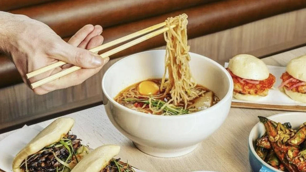
10. A Chicago Sushi Restaurant — Photography-First Menu Design
A Chicago sushi restaurant on a custom WordPress build demonstrates the conversion impact of photography-first menu design. The menu page shows photos on 30% of items — the top sellers and signature rolls — with descriptions and pricing in crawlable HTML. Menu schema is fully implemented, so Google and AI tools can accurately describe the restaurant’s menu when responding to “what does [name] serve?” queries.
Since switching from a PDF menu to the structured HTML menu with photography, this restaurant has seen a 38% increase in orders completed through the direct ordering system. The menu page is now the second-highest source of organic search traffic to the site, ranking for “[neighborhood] sushi” and multiple menu item queries.
What to steal: Your menu page is not a PDF archive. It’s a revenue page. Build it in structured HTML with photos on your best items, implement Menu schema, and watch it become your second-best organic traffic source within 90 days.
11. A San Francisco Pizza Restaurant — Mobile Ordering Conversion
A San Francisco pizza restaurant with a custom WordPress site demonstrates what happens when mobile conversion is treated as a primary design objective from day one. The mobile layout has a persistent “Order Now” button in the sticky header. The menu is scrollable with large tap targets for each item. The checkout flow is four steps from the homepage to order confirmation — optimized for thumb navigation with no required account creation.
The result: 78% of orders placed through the direct website come from mobile visitors. Mobile conversion rate is 2.1x higher than the industry average for restaurant direct ordering. The site generates more monthly revenue than the restaurant’s DoorDash, Uber Eats, and Grubhub listings combined — without paying any commission.
What to steal: Treat your mobile ordering flow as a product, not a feature. Test it on multiple real devices. Eliminate every unnecessary step between landing and order confirmation. The restaurants that win direct ordering are the ones that make ordering on their site easier than ordering on DoorDash.
12. A Dallas Fine Dining Restaurant — Schema-Driven AI Visibility
A Dallas fine dining restaurant with complete Restaurant, Menu, and FAQPage schema implementation receives significantly more AI-referred traffic than comparable local competitors. When someone asks ChatGPT, Gemini, or Google AI Overviews “best upscale dinner in Dallas” or “restaurants for special occasions in [neighborhood],” this restaurant surfaces consistently because its schema markup gives AI systems precise, structured information to work with.
AI-powered restaurant discovery is a growing and currently under-competed channel. Most restaurant websites have zero schema markup beyond a GBP listing. Restaurants that implement complete structured data today are staking out search territory that will become increasingly valuable as AI search adoption grows.
What to steal: Schema markup is now a three-channel asset: Google search rankings, Google Maps rankings, and AI search visibility. Restaurants without it are invisible to a growing share of how diners discover where to eat.
13. A Nashville BBQ Restaurant — Content-Driven Local Authority
A Nashville BBQ restaurant has built the highest organic search visibility of any independent restaurant in its market — not through paid ads, not through a large social following, but through consistent content publishing. The restaurant’s blog covers topics their potential customers search for: best BBQ in Nashville, Nashville BBQ guide, what to order at a BBQ restaurant, catering for Nashville events. Each post targets a specific search query and converts organic traffic into orders and catering inquiries.
The site now generates 40+ organic visits per day from content published over 18 months — visitors who arrive with purchase intent and convert at rates equivalent to paid traffic, at zero ongoing cost.
What to steal: Content compounds. A blog post published today drives traffic for 3–5 years. Restaurants that start publishing two posts per month in year one have a compounding organic search asset by year three that no paid advertising budget can easily replicate.
14. A Miami Brunch Restaurant — Social Proof Architecture
A Miami brunch restaurant with strong visual identity demonstrates how social proof should be architecturally integrated into a restaurant website, not appended as an afterthought. Review quotes are embedded in the homepage hero section — not buried in a dedicated “testimonials” tab. Press mentions are woven into the About page narrative. Instagram-quality food photography is used throughout the menu. The combined effect: a visitor who arrived with no prior knowledge of the restaurant trusts it before they’ve clicked anything.
What to steal: Social proof is a first-impression conversion driver, not a “nice to have” section. Integrate your strongest review quotes, press mentions, and awards into the primary conversion pages — homepage, menu, and About — rather than sequestering them to a dedicated page most visitors never navigate to.
15. A New York City Italian Restaurant — Reservation-to-Revenue Optimization
A New York City Italian restaurant operating in one of the most competitive dining markets in the world demonstrates how website architecture can turn a single reservation visit into a higher-value customer relationship. The post-reservation confirmation email drives visitors back to the website to explore the menu, read the story, and pre-select dishes. The website is then built to handle that return visit: deep dish descriptions, sourcing stories, wine pairing recommendations, and a clear path to adding private dining or special occasion requests.
The result: guests who engage with the website before their visit spend 22% more on average, and post-visit review rates are significantly higher — because the experience matched or exceeded expectations set by the website.
What to steal: Your website isn’t just for attracting new guests. It’s part of the full guest journey — pre-visit, day-of, and post-visit. Design it to add value at every stage, not just at the point of first discovery.
The 5 Patterns All High-Converting Restaurant Websites Share
Looking across these 15 examples, five patterns appear in every site that consistently converts:
- PageSpeed 90+ on mobile. No exceptions among the best performers. Fast sites rank higher, bounce less, and convert more. Slow sites are left behind regardless of design quality.
- The primary CTA is always visible. Whether it’s Order Now, Book a Table, or Find a Location — the most important action a visitor can take is always one tap away on every page.
- HTML menus, never PDFs. Every high-performing restaurant website has a structured HTML menu. This is both an SEO decision (Google indexes the content) and a UX decision (PDFs don’t work on mobile).
- Schema markup is fully implemented. Restaurant, Menu, LocalBusiness, and FAQPage schema is present and validated on every high-performing site. This is the infrastructure for Google Maps, rich snippets, and AI search visibility.
- The site is owned, not rented. Every example with superior long-term performance is self-hosted on WordPress, not on a SaaS platform. Ownership means data portability, performance control, and no dependency on a vendor’s pricing or platform decisions.
These aren’t design trends. They’re structural fundamentals that apply regardless of your cuisine, price point, or market. Get these five right and your website becomes a compounding growth asset. Miss them and it’s just a digital business card.
Frequently Asked Questions
What makes a good restaurant website design?
A good restaurant website design has five key characteristics: PageSpeed 90+ on mobile, a primary CTA (Order Now or Book a Table) visible above the fold without scrolling, an HTML menu (not a PDF), complete schema markup (Restaurant, Menu, LocalBusiness, FAQPage), and self-hosted ownership on a platform you control. Sites that have all five consistently outperform those that don’t.
What platform do the best restaurant websites use?
The highest-performing restaurant websites use custom WordPress — self-hosted, lightweight theme, no page builder bloat. This consistently delivers PageSpeed 95–100 on mobile, supports full schema markup, and gives owners complete control over their data and content. SaaS restaurant builders typically score 30–60 on mobile PageSpeed, which limits Google search rankings regardless of visual design quality.
How important is food photography for a restaurant website?
Food photography is the highest-ROI element on any restaurant website. Menus with photos generate up to 44% more monthly sales than text-only alternatives. A Google survey found customers consider food photos 1.44x more important than menu descriptions when deciding where to eat. The key is real photos of actual dishes (not stock), professionally shot, and optimized for web (WebP format, correctly sized, fast-loading).
Should a restaurant website have online ordering built in?
Yes — restaurants with commission-free direct ordering on their own website keep 100% of order revenue vs. paying 15–30% commissions to DoorDash, Uber Eats, and Grubhub. Direct ordering also gives you customer data, repeat order history, and marketing capability. The key is making your direct ordering experience as frictionless as the delivery app experience, which requires careful mobile UX design.
How do the best restaurant websites rank on Google?
High-ranking restaurant websites combine three elements: technical performance (PageSpeed 90+ on mobile, Core Web Vitals passing), structured data (Restaurant schema, LocalBusiness schema, Menu schema), and content (HTML menus, location-specific pages, consistent blog publishing). Restaurants that execute all three consistently outrank competitors in local search within 3–6 months.