
More than 80% of restaurant searches happen on mobile. Not “a significant portion.” Not “a growing share.” More than 80% — and that number has been above 70% since 2019 and continues to climb as younger diners increasingly use their phones as the default starting point for every dining decision.
Despite this, most restaurant websites are still designed for desktop and adapted for mobile — a process that consistently produces compromises: text that’s technically readable but uncomfortably small, buttons that require precise tapping, ordering flows that were clearly built for a mouse, and load times that exceed what mobile users will tolerate before bouncing.
A mobile-first restaurant website is designed the other way around: mobile is the design decision, and desktop is the adaptation. The difference in conversion rate, bounce rate, and Google rankings between these two approaches is measurable and significant.
What the Mobile Search Data Actually Shows
The case for mobile-first restaurant web design isn’t theoretical — it’s in the numbers:
- Over 80% of “restaurant near me” searches happen on mobile devices
- 53% of mobile users abandon a page that takes more than 3 seconds to load
- Bounce probability increases 32% as load time goes from 1 second to 3 seconds on mobile
- Google uses mobile-first indexing — meaning your Google ranking is determined by how your site performs on mobile, not desktop
- 61% of mobile searchers are more likely to contact a local business if it has a mobile-friendly website
- The average restaurant website loses 40–60% of mobile visitors before they see your menu
The last point deserves emphasis. Not “loses some visitors.” Loses nearly half of all mobile visitors — the majority of your potential customers — before they’ve seen what you serve. That’s not a marginal problem. That’s a structural revenue issue that exists right now on most restaurant websites.
Mobile-First vs. Mobile-Responsive: The Critical Difference
“Mobile-responsive” means a desktop website that rearranges itself to fit a smaller screen. The content is the same; the layout adapts. This is the standard approach on SaaS restaurant platforms and template-based website builders.
“Mobile-first” means the design process starts with the mobile experience as the primary use case. Every layout decision, every content hierarchy, every tap target, every image crop, every font size is made for a 390px screen first. The desktop version is then an expansion of that foundation — not a compression of it.
The practical difference:
| Mobile-Responsive (Desktop-First) | Mobile-First Design |
|---|---|
| Desktop layout squeezed to fit | Mobile layout designed from scratch |
| Buttons sized for mouse clicks | Tap targets sized for thumbs (44px minimum) |
| Desktop images scaled down | Images cropped and sized for mobile viewport |
| Full desktop content shown on mobile | Content prioritized for mobile context |
| Ordering flow designed for mouse | Ordering flow designed for one-thumb use |
| Navigation visible on desktop, hidden on mobile | Navigation designed for mobile first, expanded for desktop |
| Fonts sized for desktop reading distance | Fonts sized for mobile reading distance (16px minimum body text) |
Google’s mobile-first indexing means the Googlebot that determines your rankings crawls your site as a mobile device. If your mobile experience is a compromised version of your desktop site, your rankings reflect that compromise.
The Most Common Mobile Failures on Restaurant Websites
Tap targets too small
Buttons, menu navigation items, and links smaller than 44×44 pixels are difficult to tap accurately with a thumb. The result: visitors miss taps, accidentally trigger the wrong action, or give up entirely. Google’s PageSpeed Insights flags small tap targets as a usability issue that affects ranking.
Text too small to read without zooming
Body text smaller than 16px requires pinch-zooming on mobile. Any experience that requires zooming to read the menu is a poor mobile experience — and an SEO signal Google tracks under mobile usability.
Horizontal scrolling
Content wider than the viewport forces horizontal scrolling — one of the clearest signals of a site not designed for mobile. Common causes: wide tables, images without max-width constraints, and desktop layouts that haven’t been properly adapted.
Slow load time from unoptimized images
The majority of mobile restaurant website load time comes from unoptimized images. A hero image served as a 2400px JPEG to a 390px mobile screen is loading 6x more data than necessary, at a file size often 5–10x larger than an equivalent WebP image. On a mobile connection — which is slower than broadband — this is the most impactful single fix available.
Ordering flow not built for mobile input
Date pickers that open tiny calendar modals, quantity selectors that require precise mouse clicks, checkout forms with desktop-sized input fields — these are ordering flows built for desktop and tolerated on mobile. The abandonment rate on poorly-optimized mobile checkout flows is 70%+ for restaurant ordering. The same customer who will complete a two-minute ordering flow on DoorDash’s app will abandon a three-minute flow on a slow mobile website.
Phone number not tap-to-call
A phone number displayed as plain text on mobile can’t be tapped to call. Every reservation inquiry or question that requires copying a number and opening the phone app manually is friction that didn’t need to exist. Phone numbers on mobile restaurant websites should always be wrapped in a tel: link.
No sticky ordering CTA
On mobile, as a visitor scrolls through your menu or about page, the “Order Now” button disappears above the fold and requires scrolling back to the top to act. A sticky CTA bar at the bottom of the mobile screen — always visible, always one tap away — is the single highest-impact UX addition most restaurant websites are missing.
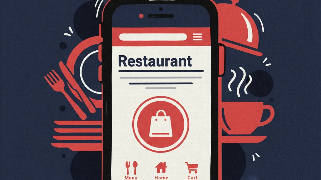
What a High-Performing Mobile Restaurant Website Looks Like
Loads in under 1 second
Sub-1-second load time on mobile is achievable — and it’s what separates restaurant websites with strong conversion rates from the ones that bleed traffic before the page renders. This requires WebP images, lazy loading, CDN delivery, asynchronous scripts, and a clean codebase with no page builder bloat. On a well-built WordPress site, this isn’t a stretch goal — it’s the baseline.
Primary action visible without scrolling
The Order Now or Make a Reservation button is the first interactive element a mobile visitor sees — above the fold, before any scrolling. On a 390px screen, this means it’s in the top 600–700 pixels of the page. Hero images, taglines, and brand photography can follow — but the conversion action comes first.
Menu readable on one hand
A strong mobile restaurant menu uses: single-column layout, large item names in 16–18px font, descriptions in 14–15px, clear category navigation accessible without scrolling back to the top, and photos that load inline without extra taps. Customization interfaces (size, toppings, add-ons) designed specifically for thumb interaction.
Location and hours accessible in two taps
Address (tap-to-map), hours, and phone number (tap-to-call) accessible from any page in the site within two taps. Footer and header should both include these — not buried in a contact page that requires navigation.
Sticky bottom bar with core actions
A sticky bar fixed to the bottom of the mobile screen containing the most important actions: Order Now, Reservations, Menu, and Call. Always visible, always reachable with a thumb, regardless of scroll position. This pattern — common in native apps — dramatically reduces the number of taps required to complete any core action on a restaurant website.
Technical Requirements for Mobile Restaurant Website Performance
Beyond design, mobile performance requires specific technical implementation:
- Viewport meta tag configured correctly —
<meta name="viewport" content="width=device-width, initial-scale=1">. Missing or incorrectly configured viewport tags cause the browser to render at desktop width and scale down. - Touch events handled correctly — 300ms tap delay eliminated (handled by
touch-action: manipulationCSS), swipe gestures working for image galleries, no double-tap-to-zoom on buttons. - Font loading optimized — Fonts preloaded in the HTML head,
font-display: swapset so text renders immediately while fonts load, preventing layout shift from late-loading custom fonts. - No intrusive interstitials on mobile — Full-screen popups that cover content on mobile are a Google penalty trigger. Google’s mobile usability guidelines explicitly penalize interstitials that block content on mobile.
- All images with explicit width and height — Prevents layout shift (CLS) as images load, keeping the page visually stable and CLS score below 0.1.
- Forms optimized for mobile input — Input fields trigger the correct keyboard type (
type="tel"for phone numbers,type="email"for email), autocomplete attributes set, fields large enough to tap without zooming.
How to Test Your Restaurant Website on Mobile
Before and after any changes, test with these tools:
- Google PageSpeed Insights (pagespeed.web.dev) — Run on mobile mode. Shows Core Web Vitals, specific failing elements, and prioritized fixes.
- Google Search Console → Mobile Usability report — Lists pages with mobile usability errors: text too small, tap targets too close, content wider than screen.
- Chrome DevTools Device Mode — Simulate your site on specific phone models at real mobile dimensions. Test every page at 390px (iPhone 14) and 360px (common Android) width.
- Real device testing — Open your website on an actual iPhone and Android device on a mobile connection (not WiFi). This is the most accurate test of what your customers actually experience.
- Google’s Mobile-Friendly Test (search.google.com/test/mobile-friendly) — Pass/fail assessment of mobile usability from Google’s crawl perspective.
How RichMenu Builds Mobile-First Restaurant Websites
Every website RichMenu builds is designed mobile-first, not mobile-adapted:
- Sub-1-second mobile load time — WebP images, lazy loading, CDN, asynchronous scripts, and clean WordPress architecture with no page builder bloat
- Mobile-first layout design — every page designed for 390px first, expanded to desktop rather than compressed from it
- Thumb-optimized navigation and ordering flow — tap targets 44px minimum, single-column menu layout, sticky bottom CTA bar
- 95–100 PageSpeed on mobile — passing all Core Web Vitals, zero mobile usability errors in Google Search Console
- Phone numbers as tap-to-call links — every contact number triggering a call with one tap
- No intrusive mobile popups — CTAs are embedded in content, not blocking it
See what a mobile-first restaurant website looks like in practice →
Frequently Asked Questions
What is a mobile-first restaurant website?
A mobile-first restaurant website is designed with mobile as the primary use case — every layout decision, tap target size, font size, image crop, and ordering flow is made for a phone screen first. This is different from a mobile-responsive website, which takes a desktop design and adapts it for smaller screens. Mobile-first produces significantly better UX, faster load times, and better Google rankings because Google uses mobile-first indexing to determine rankings.
How important is mobile for restaurant websites?
Critical — over 80% of restaurant searches happen on mobile devices. Google ranks websites based on their mobile performance. A restaurant website that loads in 4 seconds on mobile loses more than half its visitors before the page renders. Mobile is not a secondary consideration for restaurant websites — it’s the primary use case that should drive every design and performance decision.
What makes a restaurant website mobile-friendly?
Key criteria: loads in under 2 seconds on a mobile connection (under 1 second is ideal); all text readable at 16px without zooming; tap targets at least 44×44 pixels; no horizontal scrolling; phone numbers as tap-to-call links; primary conversion action (Order Now or Reserve) visible without scrolling; ordering flow usable with one thumb; and a PageSpeed score of 90+ on mobile.
How do I make my restaurant website faster on mobile?
The highest-impact improvements in order: convert all images to WebP format and size them for mobile viewports; implement lazy loading for below-the-fold images; preload the hero image; move third-party scripts (ordering widgets, analytics, chat) to load asynchronously after main content; enable server-side caching; and serve all assets from a CDN. These changes alone typically move a restaurant website from 3–5 second load times to under 1 second.
Does Google penalize restaurant websites that aren’t mobile-friendly?
Yes — in two ways. Google’s mobile-first indexing means rankings are determined by the mobile version of your site. A poor mobile experience directly suppresses rankings. Additionally, Google’s Core Web Vitals (LCP, INP, CLS) are measured on mobile and are confirmed ranking factors — failing these signals penalizes ranking position on competitive local queries.
What is mobile-first indexing and how does it affect restaurant SEO?
Mobile-first indexing means Google’s crawler evaluates your website as a mobile device when determining search rankings. If your mobile site has slower load times, missing content, or poor usability compared to your desktop site, your rankings reflect the mobile version — not the desktop version. For restaurants, this means desktop-first website design directly harms Google rankings even for customers who discover you on desktop.